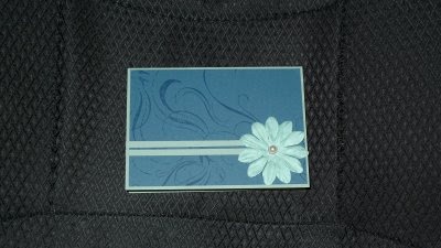
So here are the cards I made last night. I didnt get very far before I sliced my thumb open (ON A PLASTIC INK PAD) and had to stop. First I knew I needed a sympathy card for my personal trainer but she is young (23) and I didnt want to make it fuddy duddy or too gloomy. I'm not sure I achieved it, I'm not sure if I like it even but I think it suits her and that's what counts.
I made two of these because what better to balance out the misery that is making sympathy cards than baby cards. These were actually made except not stamped so I was finishing them off. The colour is really off, the background card is in fact cream (as is the ribbon) and the greens are really mellow and baby toned.
Tuesday, July 28, 2009
Sunday, July 26, 2009
Another evening making cards
Tonight I'm doing something a little different. I'm uploading these in the order I made them with a few of my thoughts as I went along.
CARD 1: I had this vague design in my head. I also wanted to experiment with whether black card is acceptable if you add bright colours to it. Yes or no? I say yes. However after I made it I didnt like the single pink stripe under it that much...
CARD 2: The second in the 'is a black card ok?' test. This time I split the green so it was above and below the white. I liked it better. In actual fact this card is beautiful in real life but the night time photography hasnt done it justice. All the greens tone (ink, paper and flower).
CARD 3: Is a black flower ok? The first thing Ryan commented on was the black flower, he doesnt like it even if it has a pretty pearl centre. Design the same as the green card above, just different colours.
CARD 4: Two stripes underneath...ok but I think they should have been thinner?
CARD 5: And what happens when I move the poked holes to below instead of above? Does it work? Yeah I think so.
CARD 4: Two stripes underneath...ok but I think they should have been thinner?
CARD 5: And what happens when I move the poked holes to below instead of above? Does it work? Yeah I think so.
CARD 6: Using a scalloped edge and smaller flower. I think it's pretty, but I have these two black scraps left over from punching the scalloped edge. Slap them on the bottom, they're thin like I wanted in the red and blue card further up. I quite like this card, this along with the green are my favourites of tonight.
Tuesday, July 21, 2009
Playing around...
Tuesday, July 14, 2009
Moon kitties and dad's birthday card
I made these in the middle of last night. Question for you...do you like the moon coloured in or not coloured in? Also if I had coloured the moon in, could I then have put brown kitty on a brown card still?
This one is dad's birthday card this year. It has photographed badly, that brown cardboard in the background is actually the same brown as the cat card above and that greeny background is actually a light navy. This card bugged me when I was finished, and it took me a while to realise it was the colour I had stamped his age onto. Still, I sent it because dad's well...he's a male and they probably dont give a darn about birthday cards (though dad always loved hand made things, he still uses a hook I made him in metal work when I was 12 and he has a drawer full of my cards). Ignoring colours, what do you think of it? This was made using a stampin' up! background stamp, inkpad (close to cocoa) and cardboard (close to cocoa, not quite navy and whatever they call that shade of caramel the numbers are on) and kaiser repositionable number stamps.
Subscribe to:
Posts (Atom)